
7 Signs Your Website Needs a Redesign
Is your website no longer delivering results? More often than not, the problem is that your business has evolved, but your digital front end hasn’t kept up. An effective redesign isn’t about radical change for the sake of aesthetics; it’s a strategic adjustment of functionality, structure, and user experience. We want to help you figure out whether your website or online store actually needs a redesign.
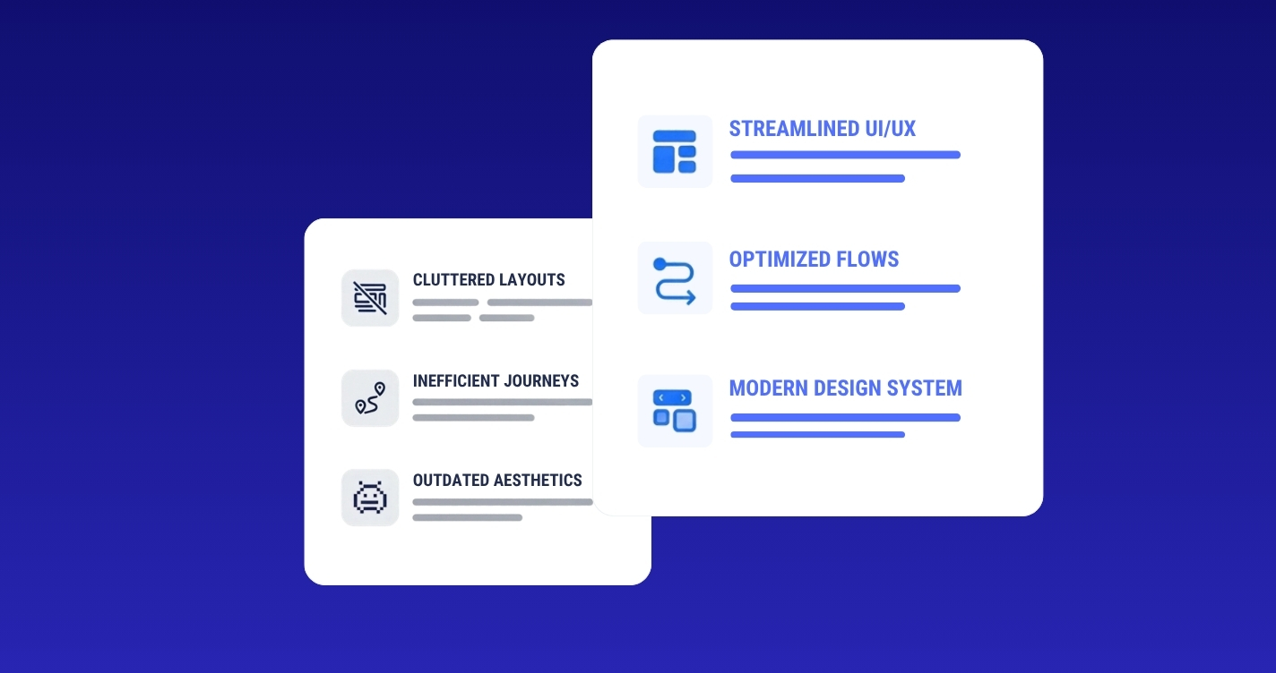
Is your site functional, but no longer bringing in as many customers or reaching your target audience?
Usually, the reason is simple: the site was built for the company you were a few years ago, not the one you are today. And in the meantime, your business has moved on.
1. What Does “Redesign” Actually Mean?
When we hear “redesign,” we immediately think of a new look. But a true redesign also means changes to functionality and structure aimed at delivering a better experience for visitors and supporting your current business goals.
A redesign doesn’t always mean an overnight, fundamental rebuild. That kind of full reconstruction only makes sense when the technical foundation can’t be saved, or when your business has pivoted 180 degrees.
A useful principle to keep in mind:
“A good redesign is an evolution, not a revolution.”
7 Signs, From Our Experience, That Your Website Needs a Redesign
1. It’s Not Optimized for Mobile
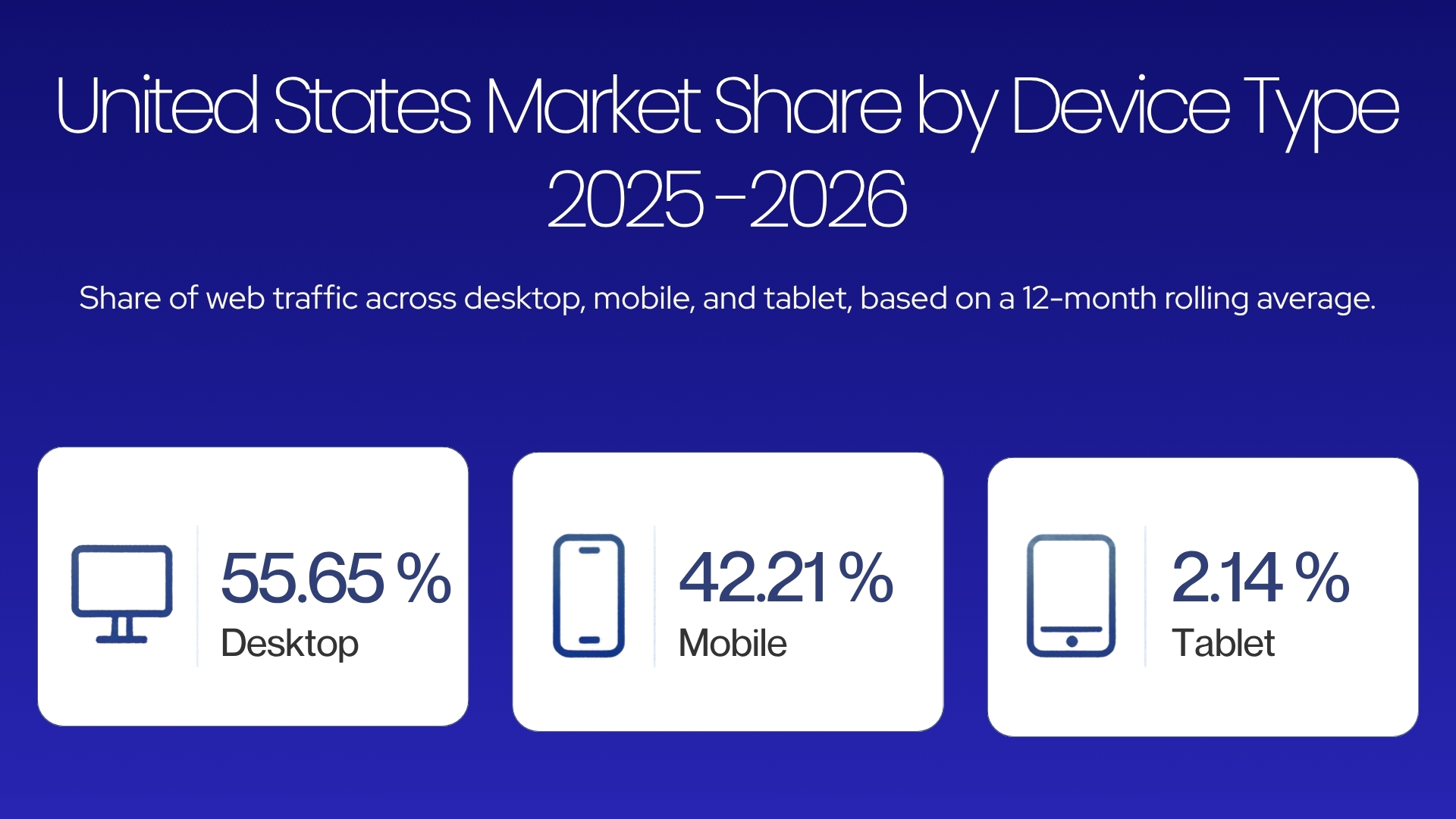
In the U.S., 42.21% of web traffic comes from phones, a number that increases annually. If your site isn’t responsive, buttons are too small, text is hard to read, or scrolling is difficult, many visitors will leave before they even understand what you offer.
2. Pages Load Slowly
Almost half of users expect a site to load in under 2 seconds, regardless of device. Each additional second of load time can reduce conversions by up to 7%.
Sometimes, ideal load times can’t be achieved through technical optimization alone (optimized images, caching, CDN). In these cases, you can use perceived performance techniques:
Lazy-loading for images and video
Placeholders for products that are still loading
Skeleton screens for lists and grids, when the layout is predictable and loading takes between 0.5 and 3 seconds
For very long load times, it’s more important to optimize the backend and load content progressively than to rely solely on visual effects.
3. Your Platform Is Holding You Back
A platform that was a good fit at the start can become a limitation as your business grows. WordPress, for example, is a solid choice for a brochure site or an online store in the early stages: you can launch quickly and keep costs under control.
But what happens when your store reaches thousands of products and significant traffic? At that point, core modules start slowing the site down and creating technical conflicts, making every new feature harder to integrate. Maintenance becomes increasingly complex, and that’s a clear signal you’ve outgrown a simple implementation and need a custom, scalable solution.
4. Your Brand Has Evolved, But Your Site Hasn’t
Your business evolves: a different positioning, new products, a new target audience. That evolution needs to show on your website. Otherwise, it will keep telling an outdated story.
Visual inconsistencies, outdated messaging, or a tone that doesn’t match your current social media communication create confusion. For a new visitor, this lack of alignment signals brand uncertainty, even when your vision is completely clear.
5. The Design Looks Visibly Dated
Visual trends change quickly, and a site that looked modern a few years ago can feel outdated today. Cluttered elements, hard-to-read fonts, or an overcrowded layout are clear signs the interface has fallen behind.
The problem goes beyond aesthetics. A dated design gives the impression of neglect, leading visitors to assume your services are just as outdated, regardless of their actual quality.
6. Navigation Is Complicated
If a visitor can’t find the information they want within a few seconds, they’ll leave your site in favor of the competition. An overloaded menu, overlapping categories, or ambiguous labels force the user to put in unnecessary effort.
7. The Quote or Contact Process Is Clunky
Manual, delayed responses to quote requests mean lost clients in favor of faster competitors. An intuitive form with an automatic confirmation message makes the difference between a converted lead and an abandoned one.
The critical point is the effort required from the visitor. Every extra step, hidden piece of information, or mandatory phone call for an estimated price pushes away exactly the clients who are ready to buy but refuse a bureaucratic process.
One Signal or Several at Once?
More often than not, a website or online store doesn’t show just one of the signals above, but a combination of several.
A recent client operating in the energy sector in the U.S. had a website that hadn’t been updated in over a decade. The interface was outdated, the fonts fatigued readers, and the color palette no longer reflected the brand’s current values. Mobile optimization was almost non-existent, and much of the service information was incorrect or incomplete.
We started by analyzing the current direction of the business and the target audience. Keeping the elements that still worked, we created a modern structure aligned with current standards:
Clear typography: Mulish, Source Sans 3, and Playfair Display
A color palette anchored in Prussian Blue tones and neutral backgrounds
Why this visual direction?
Mulish & Source Sans 3: Modern sans-serif fonts, extremely legible on any screen (mobile or desktop). They bring clarity, convey professionalism, and make long texts or technical data easy to scan without eye strain.
Playfair Display: An elegant serif font, used strategically for headings only. It adds authority, refinement, and stability—essential for an energy-sector company that wants to inspire trust.
Prussian Blue & Neutral Tones: Prussian Blue suggests safety, seriousness, and technical expertise, making it the perfect hue for the energy space. Combined with a warm, neutral background, the interface avoids a sterile, fatiguing white, offering an airy visual contrast and a comfortable browsing experience.
Conclusion
A website isn’t a static project. When the interface becomes slow, hard to navigate, or out of sync with your current service quality, you’re losing customers to faster competitors. If you recognize these signs, it might be time to consider a redesign for your website or online store.
A redesign doesn’t have to mean a radical overhaul or a chaotic process. As we mentioned, we believe a good redesign is an evolution, not a revolution.
Recognizing these signs?
Your website might be losing leads to better-aligned competitors. A quick audit will reveal the exact tweaks you need to boost conversions.